96 | nº 31, pp. 87-105 | doxa.comunicación
July-December of 2020
Visualisations as a critical information source for data journalism. Analysis of the typology, interactivity...
ISSN: 1696-019X / e-ISSN: 2386-3978


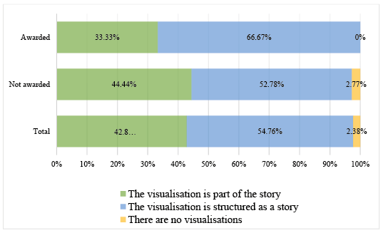
Figure 2: The functions of the visualisations in the awarded and nominated projects
Source: created by the authors
If we focus on examining the award-winning publications, there is a clear preference for positioning the visualisations as the centre of the stories (66.70%), leaving the text in the background. This function is in line with the predominant use of structured infographics, such as scrollytelling in the award-winning items. In the works without an award, the proportion of the projects that opt for one or another function is similar, so there is no clear preference for one of them (in 57.80% of the cases, the visualisation is structured as a story and is the centre of the item, in 44.4% it is incorporated to add value to the text itself and is complimentary, while in 2.78% no visual element is included).
In general, data visualisations usually show associations between variables (57.14%) and temporal evolutions (52.38%), leaving aside those that choose to compare figures (28.57%) or provide other information (14.29%).
No substantial differences in this sense can be seen in the awarded items. The works show connections and flows (66.70%), changes in time (50%), and comparisons (50%). Four of the six awards -. winners focus on representing the data with a single mission, while the remaining two combine some of the purposes mentioned above. It is similar with the non-awarded ones: predominately those that show relationships between variables (55.56%) and those that show modifications in different periods (52.78%), followed by those that focused on comparing figures (25%).