98 | nº 31, pp. 87-105 | doxa.comunicación
July-December of 2020
Visualisations as a critical information source for data journalism. Analysis of the typology, interactivity...
ISSN: 1696-019X / e-ISSN: 2386-3978


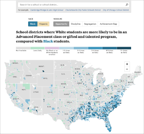
Figure 4: “Miseducation” project by ProPublica and The New York Times
As shown in Table 2, all the interactive visualisations examined (100%) include the option to browse the resource for details on request, mainly by moving the cursor. Other alternatives, such as filtering the information (47.37%), selecting elements to highlight something in the graph (21.05%), and summarising by adjusting the levels of vision (15.79%), are located at a greater distance. To a lesser extent, components are added to highlight associations and relationships between the data (10.52%), personalise visualisations by entering personal data (5.26%), and guide the reader through the story (5.26%).